You just spent an hour picking the perfect shade of teal for your logo on the computer. You matched it to the brand guidelines exactly. The hex code was flawless. You sent the file off, got your embroidery file back, loaded up a spool of what looked like matching thread, and hit start on the machine. When the design finished, you held it up to the light and your heart sank. That vibrant, electric teal from the screen now looks like a dusty, muted blue-green that your grandmother might have picked for bathroom tile in 1972. You stand there wondering if you somehow loaded the wrong bobbin or if your machine’s tension is playing tricks on you. The tension is fine. The bobbin is fine. What you just experienced is the fundamental disconnect at the heart of Embroidery Digitizing Color Issues. The screen lies. The thread tells the truth. And the gap between those two realities causes more headaches for embroiderers than almost any other part of the process. Let us figure out why this happens and, more importantly, how you stop it from ruining your next project.
The Science of Light Versus the Science of Plastic
To understand why your screen betrays you, you have to accept a hard truth about physics. Your computer monitor, your phone, and your tablet all use light to create color. They mix red, green, and blue light together. This is called the RGB color space. When you mix all three at full blast, you get pure white light. It is bright, it is luminous, and it makes colors pop like fireworks on the Fourth of July. Your eyes love it. Your brain gets excited by it.
Now walk over to your thread rack. Pick up a spool of Madeira or Isacord polyester thread. That thread does not glow. It does not emit light. It absorbs certain wavelengths of light and reflects others back to your eye. That is pigment. That is the CMYK world of printing and the physical reality of thread. Thread is shiny, yes. It has a sheen. But it can never, ever match the intensity of a backlit pixel. A neon pink logo on your website looks like it is screaming for attention because it literally is glowing light into your face. That same neon pink in polyester thread, even the brightest Robison-Anton shade, is just a very bright piece of colored plastic reflecting the ambient light in your sewing room. The moment you realize that you are comparing a lightbulb to a painted wall, the frustration starts to melt away. You stop expecting the impossible and start managing the reality.
The Dreaded “Screen Calibration” Wild Card
If the physics of light versus pigment was not tricky enough, we also have to deal with the fact that no two screens show color the same way. You might be designing your logo on a laptop that has the brightness cranked up to one hundred percent and the “Vivid” color profile turned on in the settings. Everything looks like a candy store explosion. Meanwhile, your client is looking at the same proof on their old desktop monitor that has a yellow tint from years of use and the brightness turned down to save power.
You think you are both looking at the same shade of red. You are not. This is a massive contributor to embroidery digitizing color issues because the digitizer receives an RGB file that is already a lie. The digitizer then has to interpret that lie into a physical thread chart. Unless you are using a hardware-calibrated monitor (and let’s be honest, most of us running a home embroidery business are not dropping five hundred bucks on a colorimeter puck), your screen is deceiving you just a little bit every day. The solution here is not to chase the perfect screen representation. The solution is to remove the screen from the final decision-making process altogether. You must use a physical thread chart.
Why Your Digitizing Software’s Preview is Also a Liar
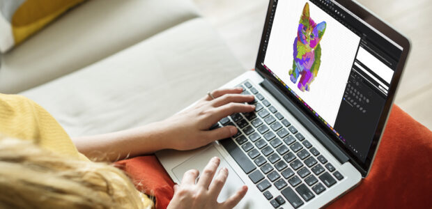
Here is a trap almost every new digitizer falls into. You open your digitizing software, you import the logo, and the software shows you a beautiful “3D rendered preview” of what the stitches will look like. The software even lets you pick thread colors from a digital library. The preview shows a perfectly blended gradient. It shows the satin stitch gleaming like liquid metal. You click save, stitch it out, and the result looks flat and chunky.
What happened? The software preview is a simulation. It is a best-guess approximation designed to help you check for registration errors and stitch angles. It is not a photograph. The software renders the thread with perfect, uniform lighting and zero physical texture. In the real world, each stitch has a tiny shadow. Each needle penetration creates a micro-valley in the fabric. Those shadows and valleys absorb light and make the color look darker and less saturated. The software also often ignores the fact that the white backing stabilizer or the black fabric underneath might slightly tint the thread color. A light yellow thread on a white polo looks bright and cheerful. That same light yellow thread on a navy blue polo might look dull or even slightly green because of the optical illusion created by the contrasting background. Your software cannot accurately predict that.
The Tangible Fix: The Physical Thread Book
If I could shout one piece of advice from the rooftops to solve embroidery digitizing color issues, it would be this: Buy a physical thread chart from your preferred thread manufacturer. Do not rely on the digital PDF they have on their website. That PDF is just another image on another uncalibrated screen. You need the actual thread wrapped around actual cardboard.
When you need to match a client’s logo, do not stare at the hex code. Pull out the physical thread book. Lay it flat on the table under the same lighting conditions where you do your stitching. Hold the client’s printed logo or the physical garment sample next to the thread samples. You will see immediately that “Madeira 1982” is a dead ringer for the navy in the logo, even though the digital color swatch on the website looked too purple. This method eliminates the translation error. It is a direct conversation between your eyes and the actual material that will end up on the shirt. It is the single most effective way to avoid the “screen vs thread” letdown. If you cannot afford the whole thread book right now, order a sample card with the small thread snips glued on. It is better than the screen. Anything physical is better than the screen.
The Dithering Dilemma: When Gradients Go Wrong
Another massive source of color frustration ties directly back to digitizing decisions rather than just thread choice. It is the issue of the gradient or the photographic fade. On screen, a logo with a subtle drop shadow or a gradient that fades from dark red to bright orange looks smooth and professional. That is because the screen has millions of pixels to play with. Each pixel can be a slightly different shade.
Your embroidery machine does not have millions of threads. You have maybe six or seven needles loaded up, or you are doing a manual color change. When you try to convert a gradient into an embroidery file, the software has to make a brutal choice. It must “dither” the design. That means it reduces the smooth gradient into a jagged series of steps using only the available thread colors. The result is often what embroiderers call “banding.” You see harsh, distinct lines where the color shifts instead of a soft, seamless transition. This is not a thread color issue; it is a design complexity issue. The fix here is communication. You need to tell the digitizer to reduce the number of colors in the gradient before they start mapping stitches, or you need to accept that a stitched gradient will have a textured, stepped appearance. It is a limitation of the medium, like trying to paint fine details with a house painting brush. Embracing solid colors and clean vector shapes solves ninety percent of these headaches before they start.
The Lighting Trick That Changes Everything
This one sounds a bit like a magician’s secret, but it is rooted in pure optics. The same spool of red thread will look entirely different under warm yellow kitchen lights compared to cool white daylight LED bulbs. If you are checking your stitch-out in a dark basement with a single incandescent bulb, you are doing yourself a disservice.
Thread has a directional “nap” to it, especially satin stitches. Light bounces off the angle of the stitch. If you hold the finished embroidery at a slight angle, the color often deepens and looks richer. If you look at it straight on, it might look flatter. This is a feature of embroidery, not a bug. It is what gives embroidery that luxurious, tactile depth. But it also means that a color that looked perfect in the thread book might look a little off under the specific lights at the event where the jacket will be worn. The only way to truly manage this is to view your color selections under multiple light sources before committing. Walk over to the window. Turn on the overhead lights. Turn on a lamp. If the color still looks good in all three conditions, you have a winner.
Communicating Color With Your Digitizer
If you outsource your digitizing, you play a crucial role in preventing color issues. Sending a file and saying “match the colors” is a recipe for disaster. The digitizer has no idea what thread brand you use. They might map the design using Robison-Anton colors while you only stock Isacord. The numbers do not match.
Always include a note with your order: “Please suggest Madeira Polyneon colors for this design” or “I stock only Floriani thread, please use their palette.” Even better, if you have already done the physical thread book match, tell them the exact number. Say, “Use Madeira 1802 for the fill and 1800 for the border.” This removes all guesswork. You are the one holding the thread book and the fabric sample. You are the only person who can make that final, authoritative call. Trust your eyes, not the hex codes.
Conclusion
The battle between the glowing perfection of the screen and the textured reality of thread is a war every embroiderer fights. You cannot win by making the thread brighter or by buying a fancier monitor. You win by changing your workflow. You win by pulling out the physical thread book and matching the actual spool to the actual garment. You win by understanding that a stitch-out viewed under soft white light is the only review that matters.
The screen is an amazing tool for layout, for lettering, and for initial creativity. But when it comes to the final, visceral, tangible color of your embroidery, the screen is just a consultant with bad eyesight. Turn away from the monitor. Look at the thread. Feel the fabric. That is where the true, accurate, and beautiful color lives. Once you make that mental shift, you will stop being surprised by the outcome and start being proud of it.